I would like to highlight here the charting capabilities of ggplot, that are based on different layers containing geoms (lines, points, bars, etc). There is at least one “aesthetic mapping” that describes how variables in the data are mapped to geoms in the basic ggplot() declaration. However, additional mappings can be defined in each layers.
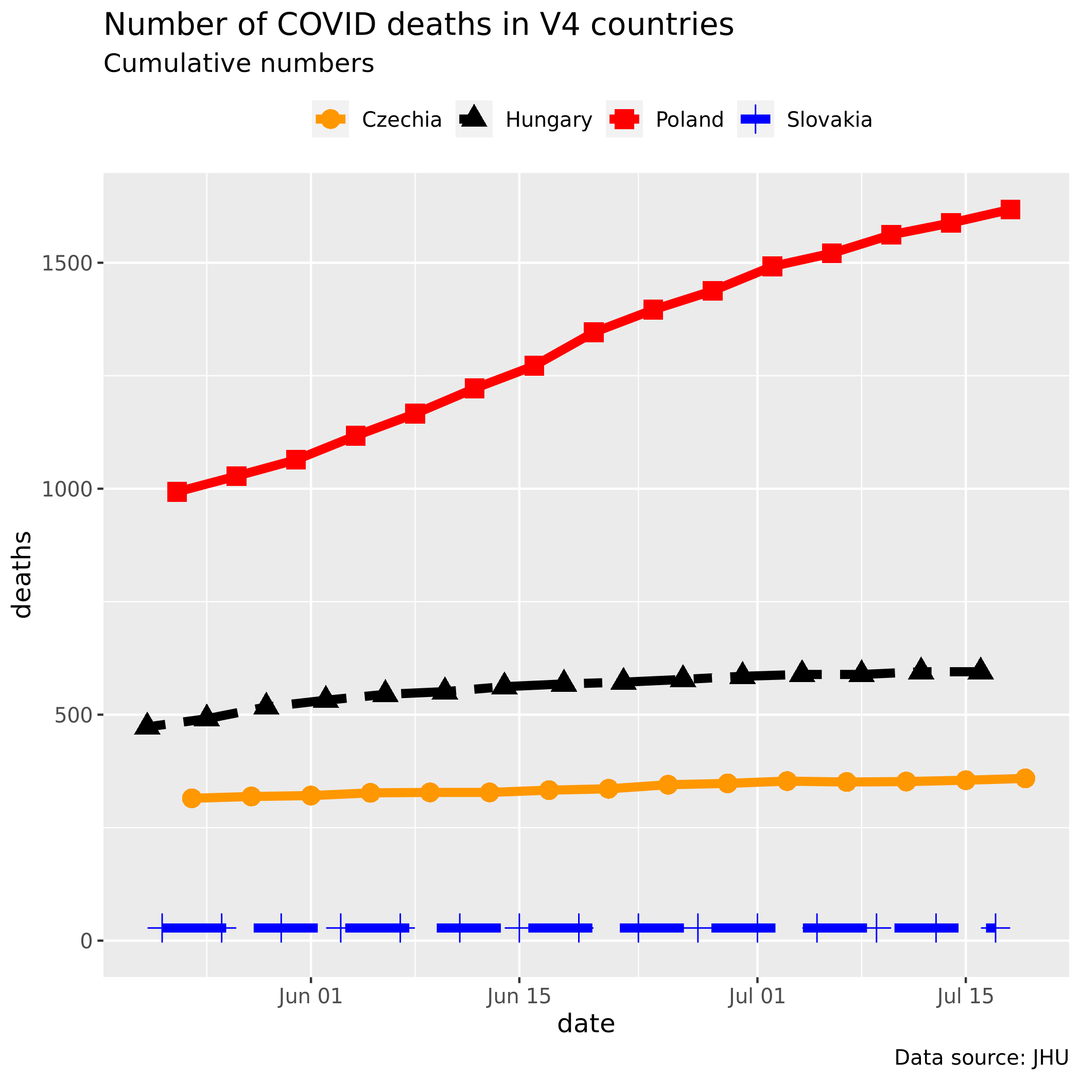
We shall create a line chart, which shows the cumulative daily COVID-19 deaths in Visegrad countries, that are Czechia, Hungary, Poland and Slovakia with R’s ggplot package.
After some data wrangling (cf. this post) I have a data frame (a “tibble”), with 3 columns and as many rows as the time-series spans from 22th of January till the most recent date. Head of the df looks like this:
      # A tibble: 6 x 3
      1   country  date       deaths
      2   <chr>    <date>      <dbl>
      3 1 Hungary  2020-01-22      0
      4 2 Slovakia 2020-01-23      0
      5 3 Poland   2020-01-24      0
      6 4 Czechia  2020-01-25      0
      7 5 Hungary  2020-01-26      0
      8 6 Slovakia 2020-01-27      0
First we define four custom colors for our lines and points that will be used by scale_color_manual().
mycolors <- c("#FF9700", "black", "red", "blue") # define 4 colours for the countries
Here comes x, y mapping (dates and number of deaths) and a group by country. (Groupping means that we want multi-lines.) We shall have two layers: one for lines, and one for points. Each contains an aes() mapped two groups.
p1 <- ggplot(df, aes(date, deaths, group = country))
p1 <- p1 + geom_line(aes(color = country, linetype = country), size = 2)
p1 <- p1 + geom_point(aes(shape = country, color = country), size = 4)
We add some ricing here:
p1 <- p1 + scale_color_manual(values = mycolors)
p1 <- p1 + scale_linetype_manual(values =
     c("solid", "twodash", "solid", "longdash")) # custom linetype
p1 <- p1 + theme(legend.position = "top", legend.title = element_blank()) # move legend to top
p1 <- p1 + theme(text = element_text(family = "Ubuntu Mono", size = 12)) # custom TTF font with extrafonts pkg
Then we add labels and limit the x-scale (date) range:
p1 <- p1 + labs(title = "Number of COVID deaths in V4 countries",
              subtitle = "Cumulative numbers",
              caption = "Data source: JHU")
p1 <- p1 + xlim(x = c(Sys.Date() - 60, NA)) # x scale range: previous 60 days
p1
That’s all. The Rscript file is here.