Over or below the red line
Summary: Current and historical mortality data can be used for assessing the net cost of the current pandemic. Hungarian data for the first eight months show a more favorable picture than that of the US. However, the infection curves are rising in several EU countries, while the spread of the virus seems to be slowing down in the United States.
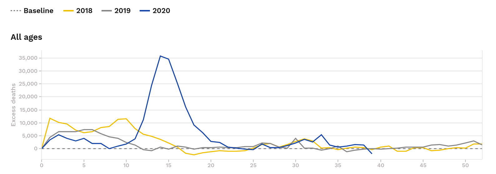
Kieran Healy (@kjhealy) has recently tweeted and published some shocking charts on US weekly mortality numbers that showed the high cost of the current pandemic in terms of mortality surplus. Compared to the previous years the overall picture looks like this (Figure 1):
Figure 1
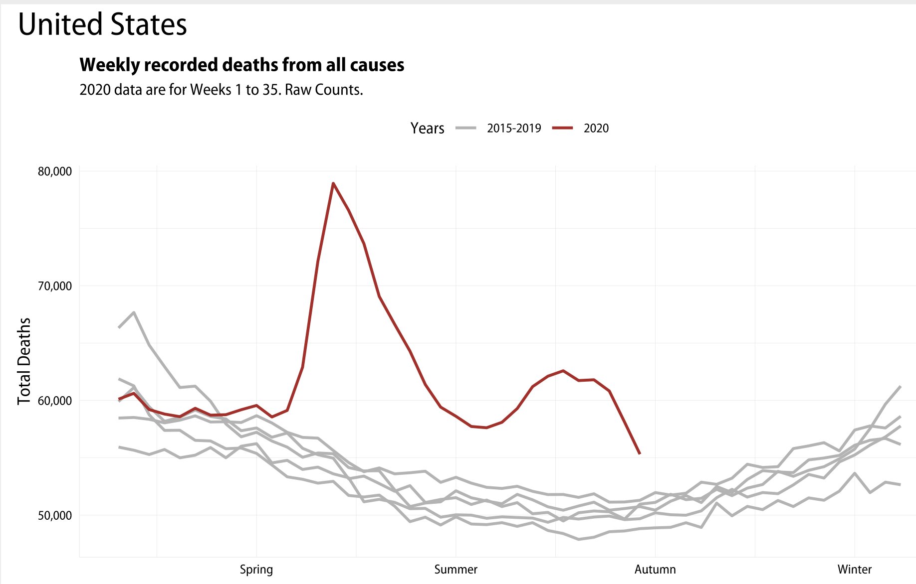
As he wrote: “Everyone under that red line was a real person. Hundreds of thousands of people are dead, and every one of them was as real as you. Brave or fearful, weak or tough, flamboyant or shy, the virus doesn’t give a shit.”
I have plotted a similar chart for Hungary using weekly mortality data from the Central Statistical Office.
The overall picture of 2020 mortality is still favorable (Figure 2) - nobody is under the red line. Yet. However, take a look at the infection curve which is rising sharply (Figure 3) in Hungary and in it’s neighbours while the curve seems to be flattening in the US.
Figure 2
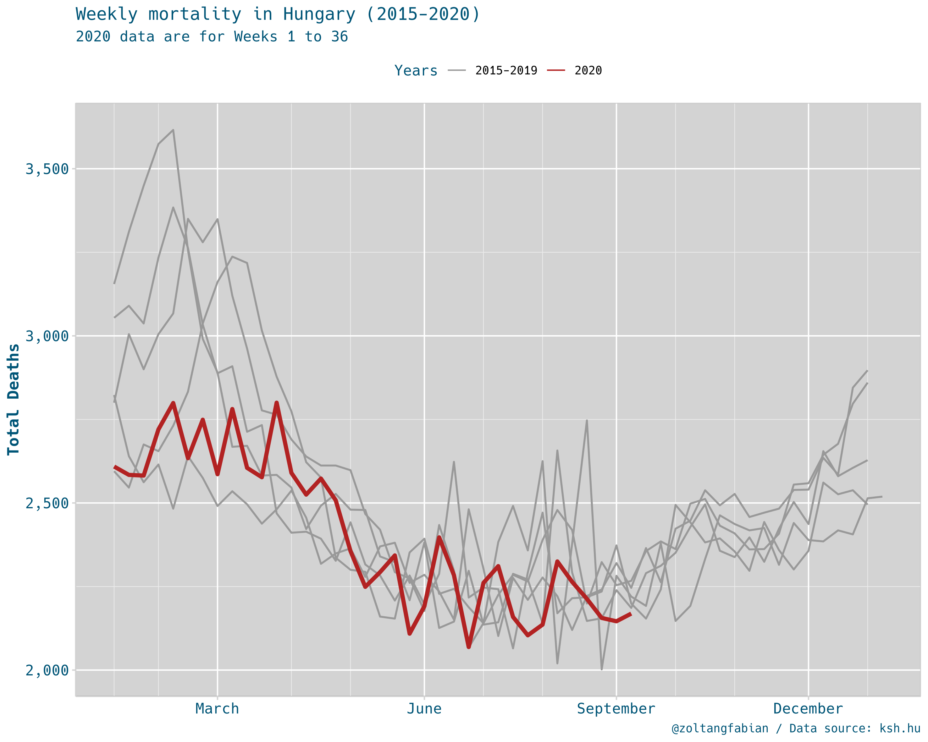
Figure 3
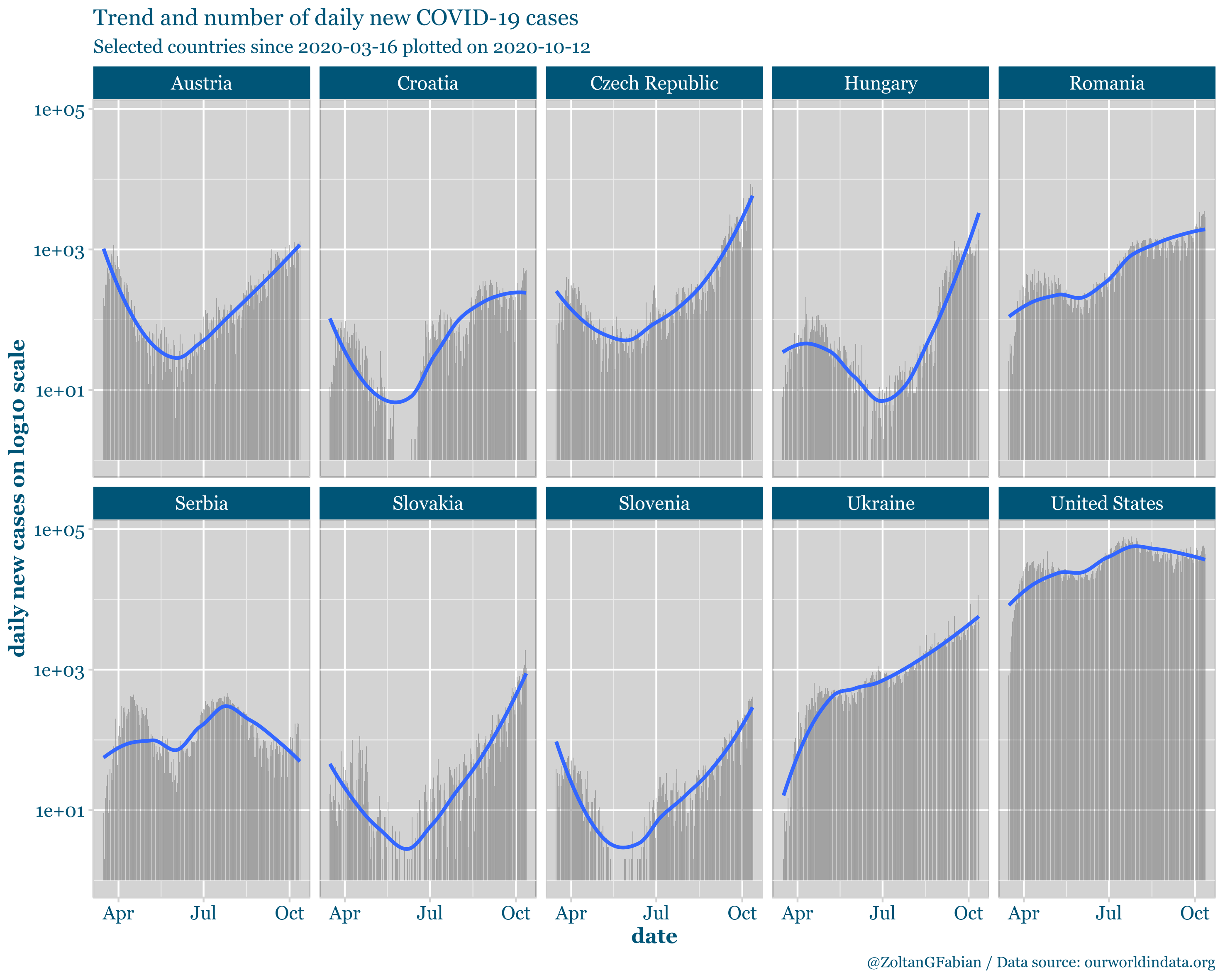
Figure 4 shows the monthly mortality rates per thousands. Data is from the CSO STADAT 1.1 table.
Figure 4
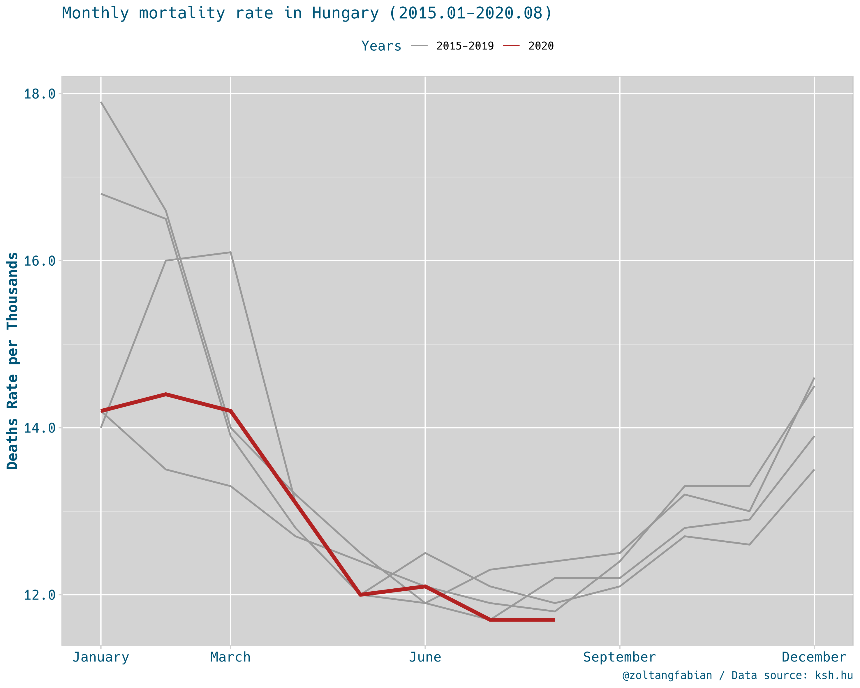
Note that Figures 1, 2 and 4 comparing historical trends within one country and doesn’t tell us much about cross-country differences.
With different methodologies similar comparisons are available for European countries from the EUROMOMO project. A sample chart is shown in Figure 5.
Figure 5
Sources:
Data: