Területdiagramok típusai és a folyamgráf
A következőkben az idősoros elemzésekben gyakran használt területdiagramok (areachart) típusaival fogunk foglalkozni. Ezek tipikusan az x tengelyen az idő dimenziót ábrázolják, az y tengelyen pedig egy numerikus értékeket (values) jelenítenek meg, egy vagy több kategóriális változó (group) vonatkozásában. Az egyszerű területdiagram tulajdonképpen a pont- és a vonaldiagram kiterjesztett változata, amennyiben színekkel tölti ki (fill) az x tengely és a vonal közötti területet.
Over or below the red line
Current and historical mortality data can be used for assessing the net cost of current pandemic. Hungarian data for the first eight months are favourable compared to the US. However the infection curves are rising in several EU countries while the spread of the virus seems to be slowing down in the States.
Adding European capitals to Eurostat map
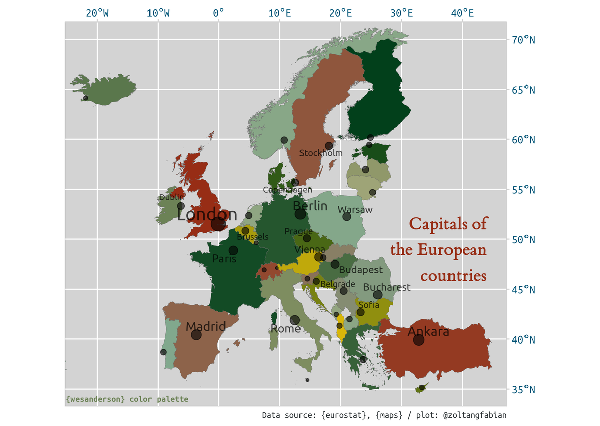
Mapping Eurostat data
Recently, I found a post on mapping Eurostat data, which was written in 2016 by Markus Kainu. It is not too old, but an important function within {eurostat} package became obsolote since then. merge_eurostat_geodata() have been abondoned because of switching to simple features standard. After some searching I found a solution to this issue1. (It also turned out that Markus Kainu is one of the devs of {eurostat}.) So, I made some minor changes in the original code base in order to reproduce and update some of the maps on NUTS2 (regional) level.
COVID-19 reproducible plots
These plots are based on a modified theme_grey and data are retrieved from ourworldindata.org’s github repo.
subscribe via RSS